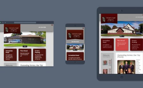
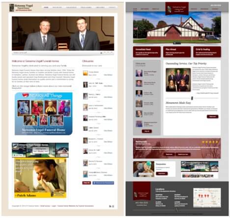
Staff at Sietsema Vogel were ready for a new look; aiming for a modern design that was easy to navigate, while keeping the design conservative and professional. Let me take you through the main points of their redesign.
 Modern design
Sietsema Vogel’s logo color was black and gold and they wanted to keep that consistent in this new design. The other colors throughout the site, however, could be changed. We used the new color scheme to create part of the modern feel to the design.
Varying shades of gray helped to create a modern feel. Burgundy provided a rich, welcoming look and stark contrast to the lighter grays, creating clean lines. The third color introduced was the bright salmon pink that, in this color combination, really draws your eye to wherever it’s used.
Another way we have brought this site into the modern era is through responsive web design.
Responsive Web Design
The amount of internet traffic on the web today through mobile devices is growing rapidly. This growth forces the need to think of ways to optimize the web experience for the site visitors. One way we optimized this experience on Sietsema Vogel’s site was by making it mobile-friendly through responsive web design.
The idea behind a responsive design is having web pages that look nice and adapt to all devices without having to create custom pages. Below is an example of responsive design in action on Sietsema Vogel’s new social site.
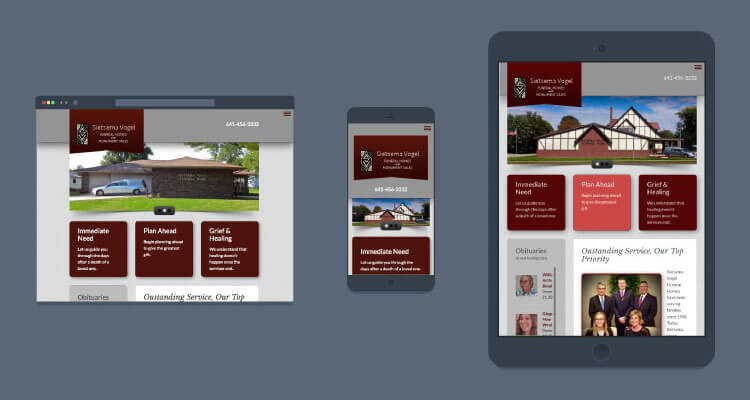 As you can see in the graphic above, content in Sietsema Vogel’s social site fluidly adapts to each browser’s screen size without losing the unique design elements.
Goal-Oriented Obituaries
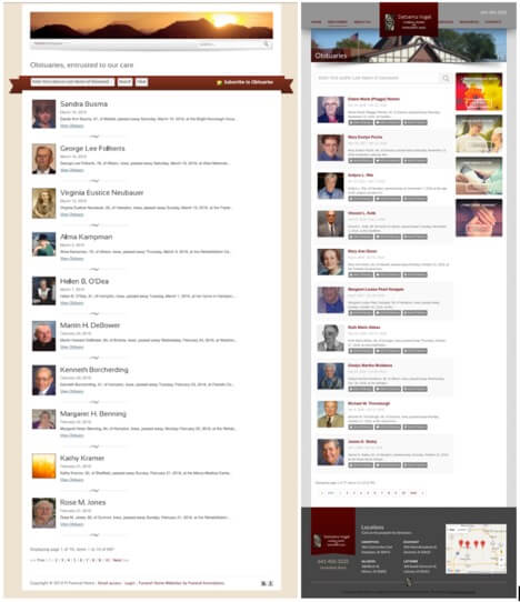 Like many other funeral homes, the vast majority of Sietsema Vogel’s website traffic comes to view an obituary. Given the amount of traffic that visits your website just for the obituaries, it is a mistake to simply enable “drive by” visitors to come to your site for a short time and never return. Instead, it’s critical to ensure these visitors are engaged, have a good experience, and even have an opportunity for follow up from your firm.
Our Goal-Oriented Obituaries provide hooks for website visitors to engage with the obituaries in ways not seen before, and even enter the funeral home’s marketing funnel. This has proven to be extremely effective in generating follow up value from all the website traffic, resulting in over 20% increase in flower sales, more engagement on the obituary, and even spurring massive newsletter list growth.
 Conservative & Professional
Today a funeral home’s website can look like so many different things. We hear lots of clients say “I don’t want my site to look like a funeral home site.” We know that what they really mean is, “I don’t want my site to look dark, outdated, stiff, or cold.” We can use colors, spacing, photos, and layout choices to create a site that’s lighter, modern and welcoming. But how can we do all that and also keep the design conservative and professional?
Showing that you’re a professional in the community can be achieved in a number of ways. We like to bring those out in our designs. Many of our headers on the main page and inside pages ring the praises of Sietsema Vogel. Phrases such as “outstanding service,” “serving families since 1958,” and “we are here to help,” when laid out properly, share the professionalism that you get when working with Sietsema Vogel.
You’ll see that we have many photos throughout the pages of this new site. Photos give you something to connect to. In this case, we chose photos that are of the same values as the community that Sietsema Vogel serves.
See for yourself
Browse through Sietsema Vogel’s new site. Tell us what you think; leave us a comment below.
Interested in a website redesign of your own? Find out more about our Social Sites or just give us a call at 1-800-641-0173.
Related blog: Avoid these 4 mistakes when having a website redesign
