Is your website an old-fashioned "static" billboard? Or a valuable resource for your community?

Take a look at your site with fresh eyes and ask yourself the following questions.
- Is it clear just what services you are offering?
- Do you highlight what is important to your online guests?
- Do you give them as much information as you can?
- How do you differentiate yourself from your competition?
- Is your site easy to use? Mobile-friendly?
- Does your site convey that you are trustworthy?
- Are you easy to contact?
- Are your obituaries engaging?

Let’s take a deeper dive into the meaning of each essential.
Is it clear just what services you offer?
Your website’s #1 job is to inform your readers of what you have to offer them. From the moment a user comes to your home page do they know what you do? Do you offer multiple services, multiple locations, or options for the bereaved to show their respect to their loved ones? Is that crystal clear without being redundant? If not, it should be.
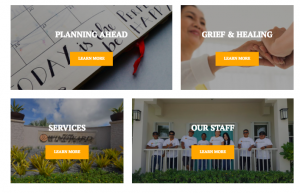
Do you frame what you offer in a way that highlights what is important to your online guests?
Your online guests quickly begin to form an opinion and understanding of your company. They internalize what they see on your website almost instantaneously. They start to answer their own questions… Is this the type of place or service I was searching for? If so how will this company bring value to me? Am I reading/seeing things that matter to me or is this website just a sales pitch or a poorly constructed, negative user experience for me? Making sure your information is built FOR your online guests’ needs is imperative.
When guests are on your website do you give them as much information as you can? Can they start to determine the costs and steps needed to take advantage of your services?
Many companies in death-care related industries do not like to openly post their pricing or specific details — they prefer the family to call them and to come in for a face-to-face meeting so that they can better convey the value and options they have directly. Well, we know people today spend 12 hours+ a day connected to online media and they expect quick, personalized information from every website. So although it may pain you to add details and pricing options – even online arranging tools to your website – it might be the difference between a person in need choosing you or closing out your website and moving on to the next provider in your area.
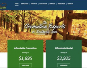
Why are you different from your competition?
When a reader comes to your site it MAY have been because they already know your brand – or it may be from a simple Google search. So when they arrive at your site will you make an impression? And, will it be a GREAT and lasting impression? Can they see and feel your location through great images and videos? Will they have an easy time navigating and finding the information they want – or will they get frustrated? When you deliver a great online impression your readers are more likely to reach out, call or stop by. Lesson here is that if your website doesn’t make a better impression than your competitions’ does – then you may be losing the competitive game.
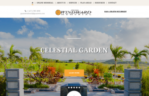
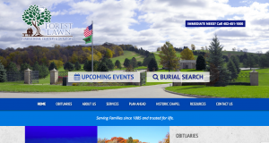
Is your site easy to use? to navigate and quick to load? How does it look on a a monitor screen or a mobile device?
Most people online have a very (and we mean VERY) short attention span (think seconds). When your online guests visit your website are they getting the information that they need, want and quickly? Are they looking for information, maps, photos, obituaries or to send flowers? What if they have just experienced a tragedy, and they are riding in a vehicle with someone trying to find guidance and make plans? Does your website work well on a mobile phone? Can they simply click the phone number, email address or map and it opens the apps they want to call, email or drive to? Does it load quickly? Can they navigate easily to what they need to see? Make sure your site makes your guests’ lives easier – not harder.

Are you easy to contact?
As mentioned previously a lot of death-care firms prefer to speak with someone directly. It may be ideal allowing your death-care firm to show compassion and build trust face-to-face. BUT not everyone wants to speak to you early on, directly. People may have the fear of an embarrassing moment when they learn they can’t afford something… but are already in the sales environment. Although this may not be the case with your firm, the unease people feel is real. So the key is to provide as much information as you can upfront, on your website. Then give options to connect, a phone number, an online form, and an email address. It could be the difference of them contacting you or the next group they come across.
Another note; People today are used to and prefer online shopping experiences, have you provided this for them? Have you gone so far as to offer online obituary access for families, areas to post tributes or even online arrangers? All of these items should be considered when you plan for your amazing website.

When you have online guests are you gaining their trust? Or turning them off?
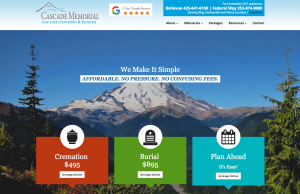
Building trust from a website can be a tough thing to achieve. Trust is subjective and can feel intangible; however it can be done with the right tone, imagery, and information. Think about what service means to you and your company and ask yourself, “will my online guests receive the same kind of service from our website? Will their first impression of my death-care firm evoke trust? Is my information clear without too much fluff? Am I too secretive about our services and pricing that they may be afraid to contact us?” You can build trust when you build your website with this in mind. You are a trustworthy company – so make sure your website says the same thing.

Are your obituaries engaging and helping you build relationships?
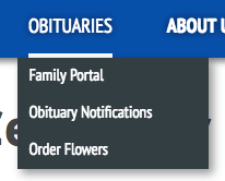
Remember as we stated before, your website is there to serve your community. When you serve your community you are building relationships. An impactful way you can do just this is through your obituaries. Offering options for people to send and share memories, photos, sign up for notifications, and send flowers or gifts through your registry via your website is a sure way to offer great service – and to build your reach and create brand awareness.

If after reading this article you think you have some work to do, we are here for you. Our job at Funeral Innovations is to help you reflect your quality of service – but where your community is… online!
Ready for the good news? Funeral Innovations builds websites for our Growth Engine clients (based on subscription level). We build them to achieve all the important goals mentioned in this article including building trust, promoting services, sharing information about facilities, lucrative and convenient gift and floral registries, online arranging AND even e-signature.

