You may have noticed that your funeral home’s Facebook Page now looks quite different. There’s nothing wrong with your eyesight – Facebook made some major changes to the business page layout. Let’s take a look at how your page has changed and what it means for your funeral home.

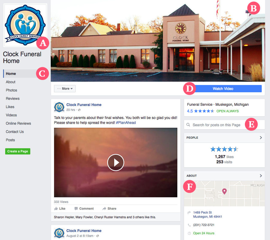
A. Profile Picture Moved to the Side
Previously your profile picture overlapped the cover photo, but now it’s moved up and to the left, heading its own column on the left directly above your firm’s name.
B. Cleaner Cover Photo
Now your cover photo is no longer overlapped by the profile picture, your firm’s name, or the call to action button. This means your cover photo stands out even more and can make a big impact in terms of branding and awareness.
C. More Tabs Are Visible
Previously many of your page tabs were hidden away in a hard to find drop down. Now they’ve got top billing in the left hand column, and all of them are shown without clicking any other button. This makes it easier to find and access different page tabs, such as Obituaries, Videos or Newsletter Signup tabs.
D. Bigger Call to Action
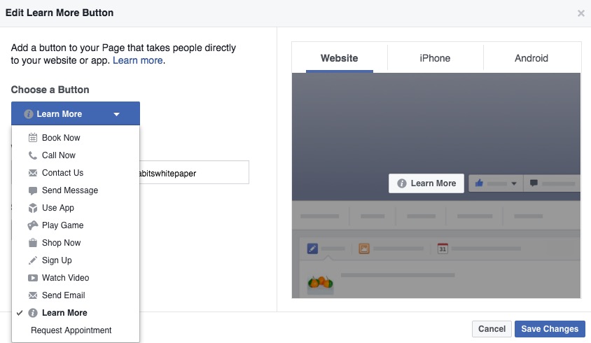
The Call to Action button is a relatively new feature Facebook provides for pages to encourage visitors to watch a video, call your firm, send a message or more. With its new placement, the button is much more prominent and attention grabbing.

E. Search Box Lets You Find Old Posts
Now visitors can use the search feature to find and reference old posts or find additional information from your page on a topic that matters to them. This is useful for referencing old obituaries or finding answers for a particular topic.
F. About Section on the Right
The about section previously was a little hard to find, buried under a page tab. Now it’s positioned in the right column in a dedicated section above the fold.
How should you react to these changes?
For the most part, these changes rearrange existing elements of your page in a way that helps visitors find what they are looking for and interactive with your business. However, there are a few ways you can adjust your page to take full advantage of the new layout.
- First, make sure your cover photo utilizes the full space it’s allotted, where previously you may have left some space open to accommodate your profile picture or business name.
- Be sure to set your Call to Action button since this is now prominently featured
- Ensure your About Us details are filled out, and if you’ve got one, add a video to be featured here.
If you have any other questions, we’re happy to help! Just contact us or learn more about how we can help your funeral home succeed on Facebook.
