For funeral homes to successfully market themselves to their communities, they must constantly re-evaluate their digital marketing efforts to double-down on what’s working and cut the cord on what’s not. Complicating this effort is the fact that technology moves FAST, and new marketing channels seem to sprout like weeds on a regular basis.
Don’t worry, though. We stay on top of these digital marketing trends so you don’t have to! Take a look at the Top 6 Digital Marketing Trends for Funeral Homes in 2017.
1. Facebook Videos
Facebook now serves only 10 billion video views per day and has been putting an increased emphasis on videos. Videos also help you cut through the noise on Facebook, and as a result, videos on average on Facebook receive 104% more reach than non-video posts.
Why is that?
Videos communicate an idea better than anything, and are more eye catching in the Facebook news feed. Videos can also be educational without being dull, offering a bite-size learning experience.
To help you reach, educate and engage your community on Facebook using videos, we’ve released a growing library of exclusive educational videos as part of our Social Media Copilot. We also offer video posts for every major holiday in 2017. All branded with your logo for ultimate brand awareness!
2. Email Newsletters
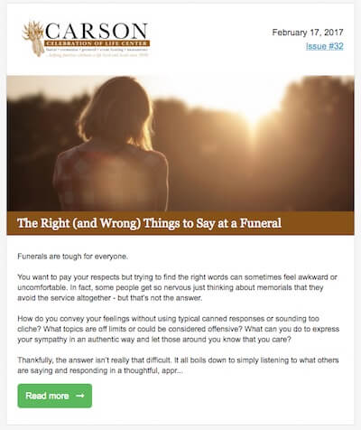 Newsletters continue to grow in popularity among funeral homes as an effective method of reaching people where you’ve got their direct attention: in their inbox.
Newsletters are especially valuable for funeral homes and cemeteries because they let you take your message directly to your community, to educate families on the value of planning ahead, announce events, and position yourself as the experts within your community. This creates valuable top of mind awareness and nurtures prospects into customers.
The best part about newsletters is that if you invest in growing your list now, it’ll continue to increase in value over time as it gets bigger and bigger. You can reach people on your newsletter list month after month to ensure your brand is positioned as the most recognized firm in your market.
You can get started with newsletters by using popular tools such as MailChimp or Constant Contact. If you really want to save time, and want access to a huge library of newsletter stories for funeral home audiences, consider using our very own Email Copilot!
3. Facebook Ads
Facebook now has over 1.2 billion (yes, BILLION) active users every single day along with millions of brands publishing posts. In short, there is more competition than ever for people’s attention!
As a result, Facebook has gradually been decreasing the organic reach for brands. But fear not, there’s one approach that guarantees you can get your best messages in front of the right people. That’s Facebook Ads!

Due to it’s hyper-targeting and incredible overall reach, Facebook advertising has now become an absolutely crucial component of any successful digital marketing strategy.
Probably the most effective form of Facebook advertising today is post boosting, or paying Facebook to insert your firm’s post into the newsfeed of your targeted market, even people who are not fans of your page. How effectively can you increase your reach via post boosting? We found that on average it costs just $0.0058 per unique impression (about 1/2 of a penny!) or $5.80 CPM (cost per 1,000 impressions). This is far cheaper than magazine advertising, which may have about $20 CPM or newspapers, which may have a $32 CPM or more.
4. Inbound Marketing
Inbound marketing is an approach to digital marketing where you draw people into your website or other digital properties by creating and promoting valuable content.
One of the simplest and most effective strategies for inbound marketing is to drive people in your community from Facebook back to your website.
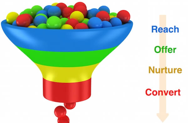 The best way for funeral homes to generate leads online is through this inbound marketing technique. It’s simple but forms the foundation of an effective marketing funnel: drive traffic from Facebook to your website, then collect the email addresses of those visitors on your website, and nurture them through email newsletters or drip marketing.
What kinds of content can you utilize to attract visitors to your website? There are tons of options: obituaries, blog posts, educational pages, and even special offers (we like to provide free email Grief Support and Planning Reminders). Next, create Facebook posts to link back to these pages on Facebook and use Facebook ads to increase the reach of those posts. You’ll then get hundreds or even thousands of new visitors to your website, where you can entice them to provide their email address to stay in front of them and nurture the relationship.
Want to make this easy? You’re in luck! Our Social Media Copilot automatically publishes Facebook posts to promote your website content and drives visitors back to your site; it even helps collect their email address!
5. Responsive Web Design
The need to have a responsive website hasn’t been greater to clients than it is now. The two reasons I can think of as to why are very simple: lots of people own mobile devices, and maintenance on both desktop & mobile is easier.
Desktop vs Mobile
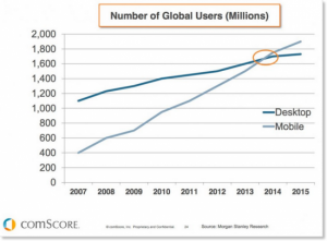 According to Mary Meeker, a technology trends analyst at Kleiner Perkins Caufield Byers, mobile was to overtake fixed Internet access in desktop by 2014. We are now in 2017, and as you can see the graphic representation of global users of both mobile and desktop devices, we can rationalize and accept that there’s an importance of optimizing our websites to equally capture both audiences.
Another thought to keep in mind is that even in our daily lives you’ll notice that we tend to do most of our browsing on mobile devices while on the go. It could be that we need to google, or yelp something. Maybe get quick contact information of a particular company from their website. A responsive-ready website will give that visitor a great optimized user experience than on the one without, where they have to try zoom in on the website to try find content. In a mobile-specific site, it might be difficult to find where that information is since the mobile website doesn’t consistently follow the design style of the parent desktop website.
Benefits
Ease of maintenance is a key factor in the importance of responsive web design. Before responsive websites came along, folks needed to create separate standalone websites to better capture their audiences. Most often updating content meant that it needed to be updated twice for both the mobile site as well as the desktop site. Plus, with two separate sites with completely different looks, important branding was lost.
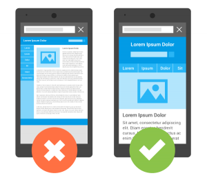
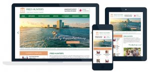
In responsive design, websites have a single content source as well as design. Responsive websites utilize fluid widths to best ensure that they scale to fit any screen size whether it be a tablet or any handheld internet-capable device. Many of the website design elements are consistent on both mobile and desktop; only shifted around and resized to respond nicely in the different screen sizes. Search engine optimization is also maintained on one site rather than multiple sites.
6. Flat, Minimalist designs
Flat and minimalist design patterns can be seen in most websites today. Sometimes you might mistake the two in what you’ve seen before. What are they and what are the key differences in them?
Flat Design
A flat designed site is a visually pleasing website. It uses a style of interface design where usage of stylistic elements is kept at a minimum. A simple example of what a flat design looks like is how the tiles in your windows 8 or 10 PC’s start menu are laid out or how your home screen of your iPhone or Samsung phone is laid out. How would this translate to a website? This could maybe be seen by using simple rectangular or circular CTA buttons on your website to remove the illusion of busy-ness on the site. This could also be seen in the simple layout of the main front-page banner as well as the simple layout of text and other design elements on the website pages.

Minimalist Design
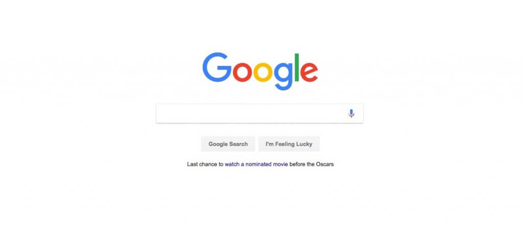
I’m sure many of you have heard the phrase; “Less is More”. Websites that use the minimalist approach tend to be far simpler to use and navigate. Look at Google as an example. Google doesn’t need to have so many colorful or beautifully designed elements or texts to deliver content to it’s visitors. It simply has it’s main logo, a text field for search and the two prominent search buttons serve its purpose. In short minimalist websites don’t necessarily mean that they’re less beautifully designed but rather deliver content that is to the point of what they want to deliver.
Over all, both the flat and minimalist designs have their benefits. It’s up to you to figure out what would be best in engaging and driving more traffic to your website.
sources:

